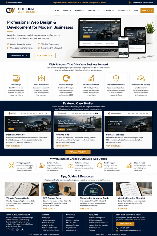
Service-business homepage pattern
A strong hero, services grid and visual hierarchy can make a commercial homepage easy to scan.
These examples examine hierarchy, cards, navigation, imagery and conversion structure. The goal is to understand why a layout works—not to clone it.
A strong hero, services grid and visual hierarchy can make a commercial homepage easy to scan.

A clean professional composition shows how proof, services and calls to action can be sequenced.
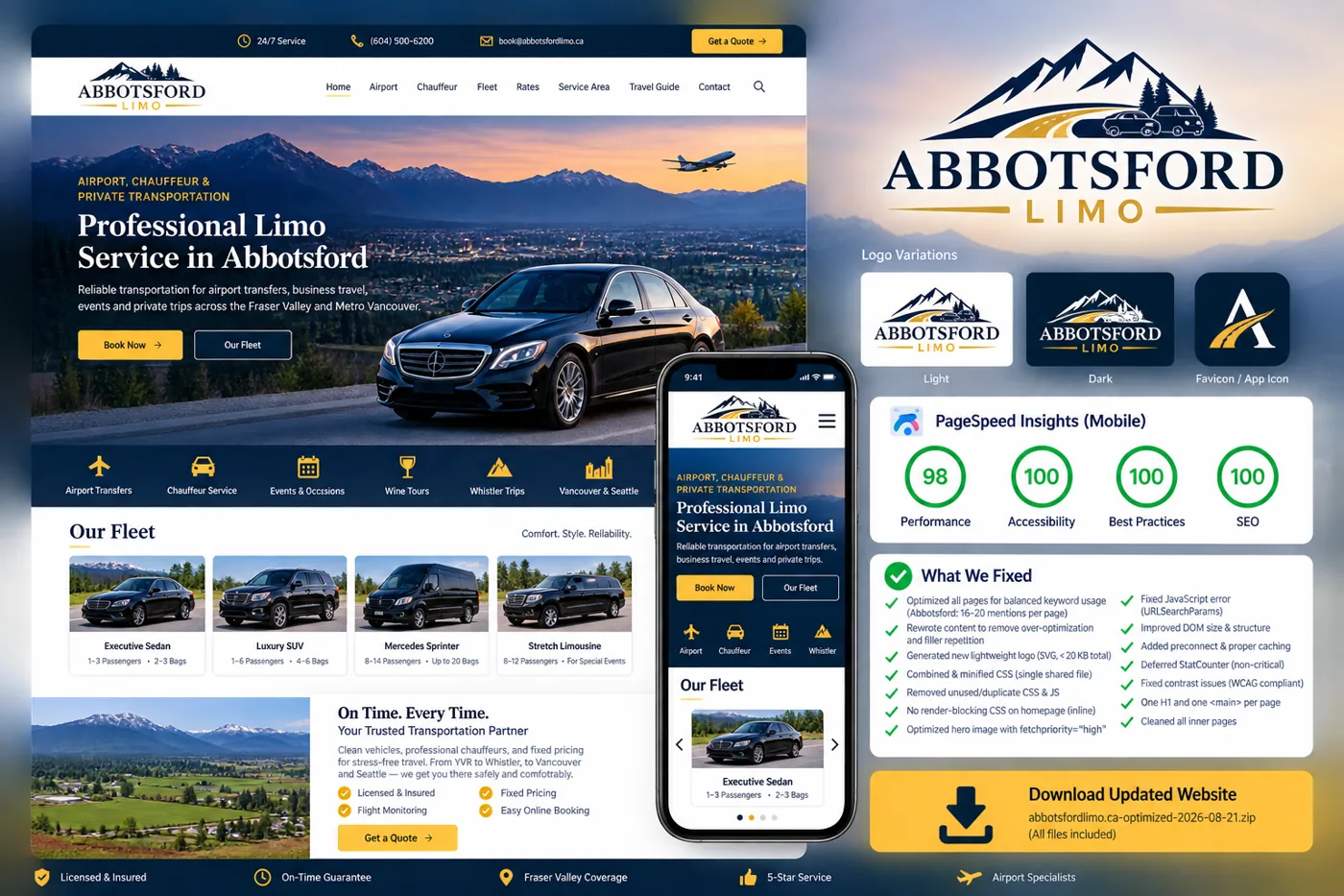
A local service example shows how hero imagery, fleet presentation and city intent can coexist.
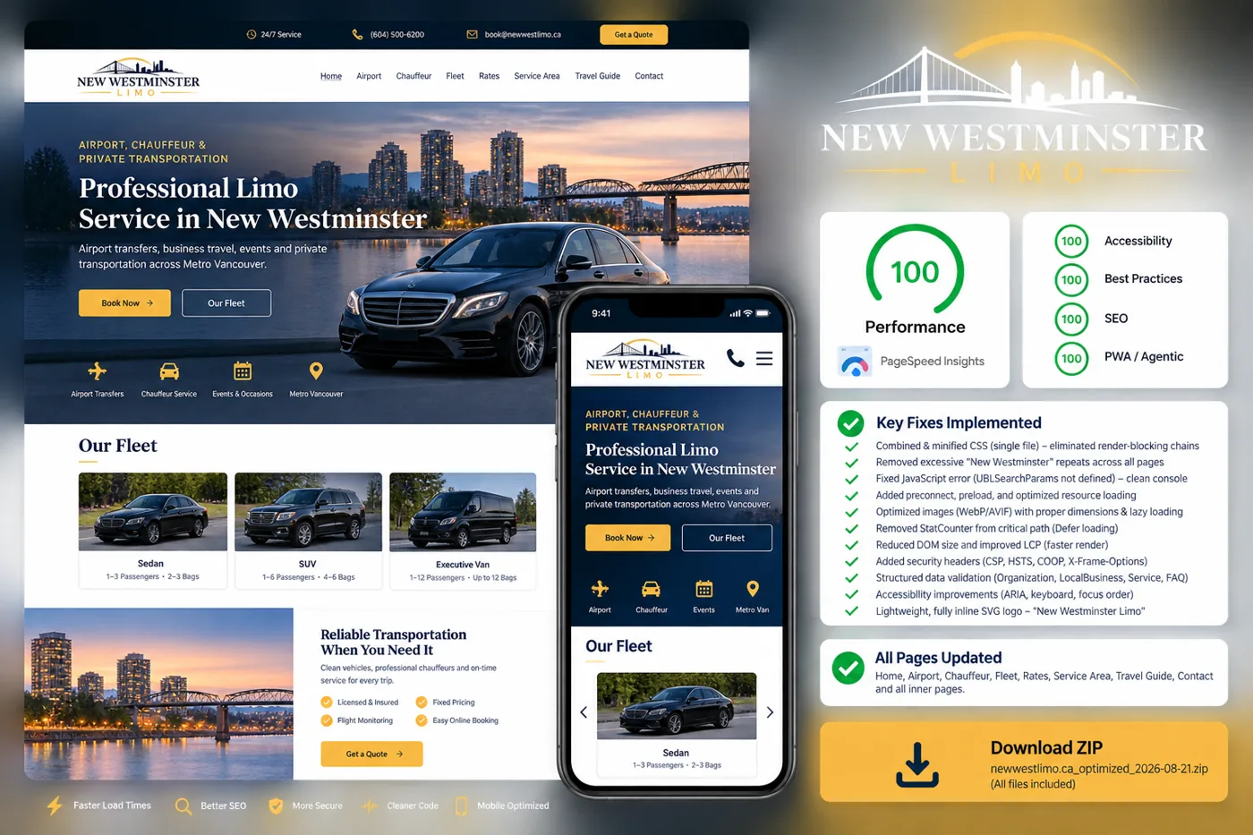
A redesign example connects visual improvement with usability, content and performance cleanup.
See how airport, chauffeur, Whistler and event services can be separated into focused user paths.
Open live example →Study a booking-oriented product where rate checks, trip details and vehicle choice form the core journey.
Open live example →See how a narrower service scope supports simpler navigation and restrained presentation.
Open live example →Review a scalable destination model with related local service pages.
Open live example →Compare a city-guide information architecture with a commercial service website.
Open live example →See how a topic guide can use lifestyle content, occasion paths and local guides without looking like a service business.
Open live example →Review a consumer buying-guide design built around materials, style, care and local shopping topics.
Open live example →See a photography-led guide balancing buying advice, safety information and local planning.
Open live example →